Component Gallery

Empower your Dashboards with BDB Powerful & Beautiful Chart Component Gallery

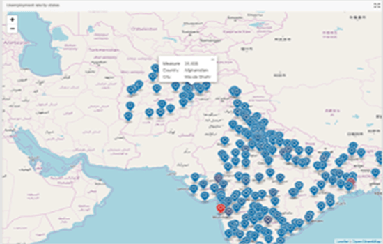
The leaflet is the leading open-source interactive map component that points the area (country, state, city) based on the latitude and longitude. This mobile-friendly map component allows users to avail all the mapping features requires for geospatial mapping. Leaflet maps are popular because of its simplicity and high performance.
To analyze the Geospatial values based on Parent to Child hierarchy.
Box Plot charts are commonly used to show distribution of data. The body of a box plot chart consists of a box which contains the median of the data located between 1st and 3rd quartiles. It also contains the whiskers which generally represents the data within 1.5 x IQR below Q1 and 1.5 x IQR above Q3 (anything outside of this range is called an outlier).The whiskers are used to show maximum and minimum points within the data.
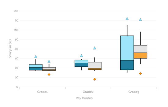
The following data was used to generate this example.
| Grade | Gender | Min | Q1 | Median | Q3 | Max | Outlier1 |
|---|---|---|---|---|---|---|---|
| Grade1 | Male | 2 | 3.6 | 5.5 | 8.53 | 14 | 16.9 |
| Grade1 | Female | 1.9 | 2.31 | 2.78 | 5.5 | 9 | 12 |
| Grade | Male | 7.5 | 11.25 | 15.25 | 18.25 | 19.5 | 23 |
| Grade2 | Female | 7 | 8.15 | 9.5 | 16 | 21 | 25 |
| Grade3 | Male | 15 | 18 | 28 | 53.75 | 65 | 72 |
| Grade3 | Female | 24 | 30 | 36 | 43.75 | 58 | 71 |
Candlestick chart is a popular way of representing price fluctuations like opening, closing, high and low prices for a given period. The candle chart has shadows coming out of each end representing the high and low prices of each trading day. The candles are colored white when the prices increased and black when the price has decreased.
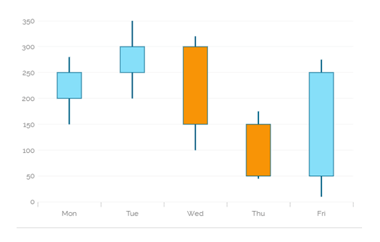
The following data was used to generate this example.
| Day | High | Low | Close | Open |
|---|---|---|---|---|
| Mon | 280 | 150 | 250 | 200 |
| Tue | 350 | 200 | 300 | 250 |
| Wed | 320 | 100 | 150 | 300 |
| Thu | 175 | 45 | 50 | 150 |
| Fri | 275 | 10 | 250 | 50 |
Chevron charts are used to represent the process flow or steps involved in a life cycle of any activity. They are represented using arrows.
Combination of phases defines a project lifecycle. The chevron provides users in-detail information of the each phase involved in the project and its status.
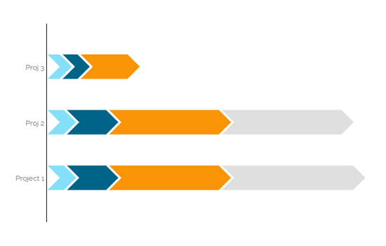
The following data was used to generate this example.
| ProjectName | PhaseName | PhaseStartDate | PhaseEndDate |
|---|---|---|---|
| Project 1 | Initiation | 1/1/2015 | 01/31/2015 |
| Project 1 | Planning | 2/1/2015 | 03/31/2015 |
| Project 1 | Execution | 4/1/2015 | 09/30/2015 |
| Project 1 | Deployment | 10/1/2015 | 11/30/2015 |
| Project 1 | Closure | 11/1/2015 | 01/31/16 |
| Proj ABC | Initiation | 1/1/2015 | 01/31/2015 |
| Proj ABC | Planning | 2/1/2015 | 03/31/2015 |
| Proj ABC | Execution | 4/1/2015 | 09/30/2015 |
| Proj ABC | Deployment | 10/1/2015 | 10/31/2015 |
| Proj XYZ | Initiation | 11/1/2015 | 01/30/2015 |
| Proj XYZ | Planning | 01/31/2015 | 02/26/2015 |
| Proj XYZ | Execution | 01/31/2015 | 02/26/2015 |
Combination of phases defines a project lifecycle. The chevron provides users in-detail information of the each phase involved in the project and its status.
The group bar chart becomes complicated to read or interpret if loaded with too much information.
To display data sets containing negative values and multiple sub-categories.
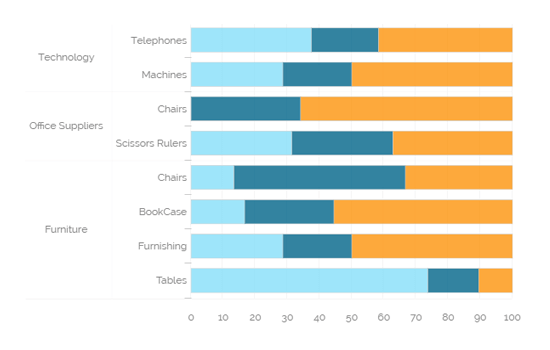
The following data was used to generate this example.
| Category | Items | Sale Day1 | Sale Day2 | Sale Day3 |
|---|---|---|---|---|
| Furniture | Tables | 140 | 30 | 20 |
| Furniture | Furnishing | 40 | 30 | 70 |
| Furniture | BookCase | 24 | 40 | 80 |
| Furniture | Chairs | 20 | 80 | 50 |
| Office Suppliers | Scissors Rulers | 65 | 65 | 77 |
| Office Suppliers | Chairs | 45 | 87 | 34 |
| Technology | Machines | 40 | 30 | 70 |
| Technology | Telephones | 54 | 30 | 60 |
A heat map visualizes data in a two-dimensional image where it uses colors to represent data values. Heat Maps allows users to understand complex data sets easily as they are represented in different color ranges. They provide an immediate visual summary of information.
To show relationship between two factors.
Geographic Type Heat Maps: For instance a geographical heat map with the colors red and blue will quickly inform the user which state each candidate has won.To show relationship between two factors.
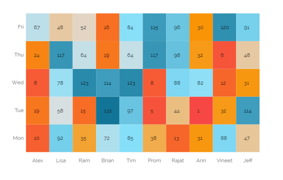
The following data was used to generate this example.
| Employee | Mon | Tue | Wed | Thu | Fri |
|---|---|---|---|---|---|
| Alex | 10 | 19 | 8 | 24 | 67 |
| Lisa | 92 | 58 | 78 | 117 | 48 |
| Ram | 35 | 15 | 123 | 64 | 52 |
| Brian | 72 | 132 | 114 | 19 | 16 |
| Tim | 85 | 97 | 123 | 64 | 84 |
| Prom | 38 | 5 | 8 | 117 | 115 |
| Rajat | 13 | 44 | 88 | 98 | 96 |
| Ann | 31 | 1 | 82 | 32 | 30 |
| Vineet | 88 | 32 | 12 | 6 | 120 |
| Jeff | 47 | 114 | 31 | 48 | 91 |
The Text Analyser chart is extremely useful to plot the popularity and sentiment graphs of various products and to identify their relationships to the actual sales of these products. It provides visualisations based on 20 emotional properties embodied in text, with their measure of confidence, which we call 'Sentiment'.
To identify customers' opinions.
To observe Churn Indicators .
To analyze customer Satisfaction and Segmentation .
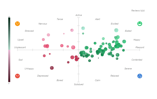
The following data was used to generate this example.
| Y-field | X-field | Color | Radius | Tooltip |
|---|---|---|---|---|
| 7.02 | 5.3 | 1.957575 | 3.218876 | Tooltip-1 |
| 7.43 | 4.57 | 1.802054 | 5.693324 | Tooltip-2 |
| 3.450359 | 4.327559 | 1.920015 | 4.135494 | Tooltip-3 |
| 7.677883 | 5.299413 | 2.297534 | 6.7301 | Tooltip-4 |
| 6.39 | 6.62 | 3.038853 | 5.276666 | Tooltip-5 |
| 4.38 | 6.55 | 2.787844 | 5.317488 | Tooltip-6 |
| 4.429281 | 5.501457 | 2.635665 | 7.016157 | Tooltip-7 |
| 4.752894 | 6.254559 | 2.26194 | 7.047372 | Tooltip-8 |
| 4.752894 | 4.752894 | 2.26194 | 7.047372 | Tooltip-9 |
| 4.752894 | 4.752894 | 2.26194 | 7.047372 | Tooltip-10 |
Timeline chart can be used to evaluate patterns and behavior in data over time. Also called 'Time Series' graphs. They show how values change over a time. Timeline charts display observations on the Y-axis against equally spaced time intervals on the X-axis.
When comparing data patterns of different groups.
When examining daily, weekly, and annual variations of a product or an entity.
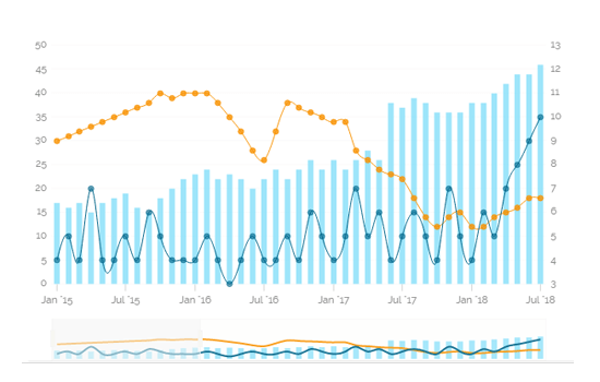
The following data was used to generate this example.
| TimeLine | Company_A | Company_B | Company_C |
|---|---|---|---|
| 1/1/2008 | 2 | 1 | 1 |
| 2/1/2008 | 3 | 2 | 2 |
| 3/1/2008 | 5 | 2 | 4 |
| 4/1/2008 | 5 | 2 | 6 |
| 5/1/2008 | 5 | 2 | 5 |
| 6/1/2008 | 5 | 3 | 4 |
| 7/1/2008 | 6 | 3 | 6 |
| 8/1/2008 | 5 | 3 | 6 |
| 9/1/2008 | 5 | 2 | 5 |
| 10/1/2008 | 3 | 4 | 6 |
Treemap charts are used to display large amounts of hierarchical data. When users want to view all of their hierarchical data at one time, tree maps can be used. Each rectangle represents a branch in a tree and it also shows how much data it comprises. The size and position of the rectangles are based on the quantitative variable used for the chart.Patterns across the data can be identified using the size and color of the rectangles.
When users want to view all of their hierarchical data at one time.
Each rectangle can be colored differently so users can understand how the hierarchical data is structured by a quick glance.
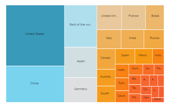
The following data was used to generate this example.
| Country | Economy Percent |
|---|---|
| Venezuela | 0.28 |
| Greece | 0.33 |
| South Africa | 0.46 |
| Denmark | 0.46 |
| Thailand | 0.51 |
| Iran | 0.54 |
| Colombia | 0.54 |
| UAE | 0.56 |
| Austria | 0.58 |
| Argentina | 0.60 |
Word Cloud is a visual representation of text data where the font size of a word depicts the frequency of this word in a set of text data. Even though Word clouds are not a perfect tool for data analysis and business data visualisations, they definitely have their place in info graphics. Word clouds can also reveal patterns in your responses that may guide future analysis.
When analysing text data
When identifying trends and patterns that would otherwise be unclear or difficult to see in a tabular format.

The following data was used to generate this example.
| Word | Frequency |
|---|---|
| you've | 1 |
| you're | 1 |
| years | 1 |
| year | 2 |
| work | 1 |
| well | 3 |
| we've | 3 |
| we're | 3 |
| way | 4 |
| want | 4 |
The Trellis chart is a network of small charts. It is a repetition of a chart across a grid. Generally, minimum two dimensions are used, one for the grid variable and another for the x-axis within each small chart. Users can analyze the metrics within each chart without a query (a selection) and compare with the rest of the group at the same time via a trellis chart. A chart will be shared on the same Y-axis, so it becomes easier for users to identify irregular behavior among the variables by accurately comparing the metrics across the grid.
When analysing text data
When identifying trends and patterns that would otherwise be unclear or difficult to see in a tabular format.
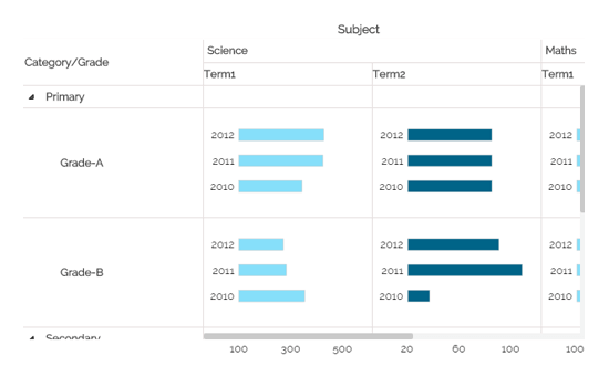
The following data was used to generate this example.
| Category | Grade | Year | Subject | Team1 | Team2 |
|---|---|---|---|---|---|
| Primary | Grade-A | 2010 | Science | 319 | 78 |
| Primary | Grade-A | 2010 | Math | 221 | 43 |
| Primary | Grade-A | 2011 | Science | 391 | 78 |
| Primary | Grade-A | 2011 | Math | 212 | 43 |
| Primary | Grade-A | 2012 | Science | 394 | 78 |
| Primary | Grade-A | 2012 | Math | 202 | 43 |
| Primary | Grade-B | 2010 | Science | 328 | 35 |
| Primary | Grade-B | 2010 | Math | 298 | 76 |
| Primary | Grade-B | 2011 | Science | 264 | 99 |
An area chart or area graph displays graphically quantitive data. It is based on the line chart. The primary use of area charts is to display trends over a period of time.
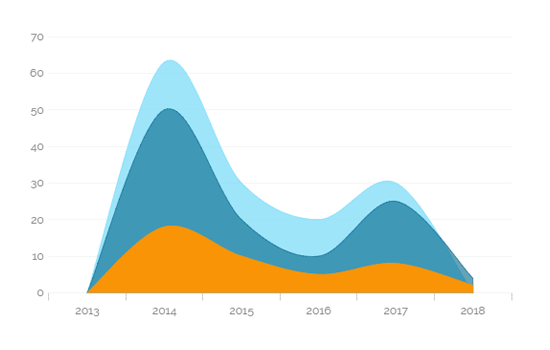
The following data was used to generate this example.
| Year | North America | Europe | Asia |
|---|---|---|---|
| 2008 | 50 | 150 | 60 |
| 2009 | 60 | 100 | 65 |
| 2010 | 100 | 80 | 70 |
| 2011 | 150 | 85 | 75 |
| 2012 | 170 | 95 | 80 |
| 2013 | 190 | 75 | 85 |
| 2014 | 210 | 90 | 90 |
| 2015 | 225 | 110 | 95 |
| 2016 | 250 | 120 | 100 |
Bar Charts are useful for comparing classes or groups of data. They are one of the most commonly used types of graph because they are simple to create and very easy to interpret. There are several variations that are included in the standard bar chart like stacked bar charts, grouped bar charts and horizontal bar charts.
When the data set is small it would be easier to the end user to interpret data. Observations over a period of time can be performed.
Quarterly sales of an organization.
% of change (+/-) in sales or revenue can be indicated.
Use stacked bar charts: Where multiple categories can be clubbed together on top of each other which makes addressing multiple questions becomes easier.
Use bars side by side: Where comparison between multiple categories becomes easier instead of toggle between charts.
Add color for quick insight: Displaying the bars with colors will make users to pay quick attention to important tasks.
Plotting data on both axis: Data can be plotted both on positive and negative axis for identifying the trends.
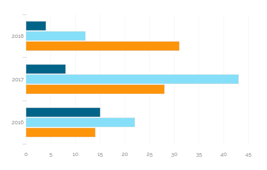
The following data was used to generate this example.
| Year | Expense | Revenue |
|---|---|---|
| 2011 | 80 | 85 |
| 2012 | 100 | 95 |
| 2013 | 120 | 135 |
| 2014 | 140 | 180 |
A bubble chart visualizes data set in three of four dimensions. Where the first two dimensions are used as co-ordinates like x-axis and y-axis. There remaining two are used to represent color and size of the bubbles. Mostly used to plot financial data.
Three Data Series: If your data has three series each containing values then you can use bubble chart for better representation. Generally the sizes of the bubble are determined by the values..
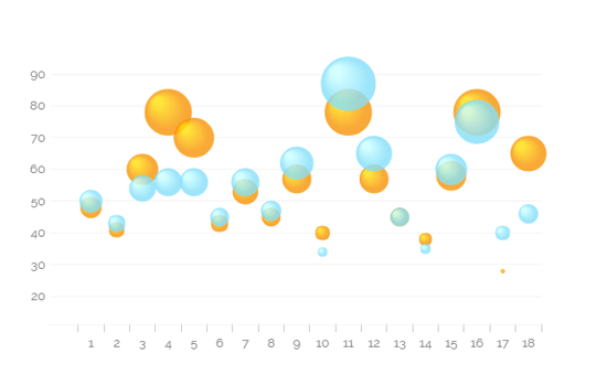
The following data was used to generate this example.
| Year | Expense | Revenue |
|---|---|---|
| 1 | 48 | 50 |
| 2 | 41 | 43 |
| 3 | 60 | 54 |
| 4 | 78 | 56 |
| 5 | 70 | 56 |
| 6 | 43 | 45 |
| 7 | 53 | 56 |
| 8 | 45 | 47 |
| 9 | 57 | 62 |
| 10 | 40 | 34 |
The Circumplex chart, also known as Polar Area chart or Nightingale Rose chart, is a combination of the Bar chart and Pie chart. The Circumplex chart can be drawn on a polar coordinate grid. Each category or interval in data is divided into equal segments on the radial chart. The distance of each segment from the center, as per the denoted values, depends on a polar axis. Therefore, each ring from the center of the polar grid can be used as a scale to plot the segment size and represent a higher value.
Each category may have more than one sub-category, where each sub-category is shown by a section of the disc and each section has the same angle. The value of the corresponding sub-category is shown through the area. By changing the radius in a Circumplex chart, users can adjust the area of each segment (based on data).
To display manifold data in the form of a two-dimensional chart of three or more measurable variables represented on axes starting from the same point.
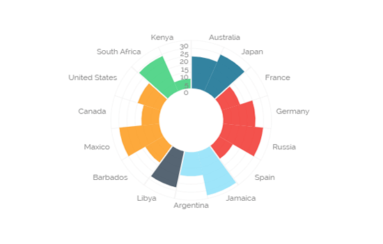
The following data was used to generate this example.
| Region | Country | 2008 | 2009 |
|---|---|---|---|
| East Asia & Pacific | Cambodia | 3 | 20 |
| East Asia & Pacific | Australia | 19 | 25 |
| Europe & Central Asia | Ukraine | 7 | 16 |
| Europe & Central Asia | Russia | 9 | 19 |
| Europe & Central Asia | Kazakhstan | 18 | 26 |
| Europe & Central Asia | Afghanistan | 8 | 13 |
| Latin America & Caribbean | Paraguay | 6 | 27 |
| Latin America & Caribbean | Argentina | 9 | 18 |
| Middle East & North Africa | Libya | 6 | 23 |
Column charts are used when you want to compare the values of individual data points with another. They help in bringing out the highs and lows of the data set.
Column charts are good for displaying data sets with negative values.
Example: To find the best and worst performers in an organization
Use stacked Column charts: Where multiple categories can be clubbed together on top of each other which make addressing multiple questions easier.
Use column side by side: Where comparison between multiple categories becomes easier instead of toggling between charts.
Add color for quick insight: Displaying the Column with colors will make users to pay quick attention to important tasks.
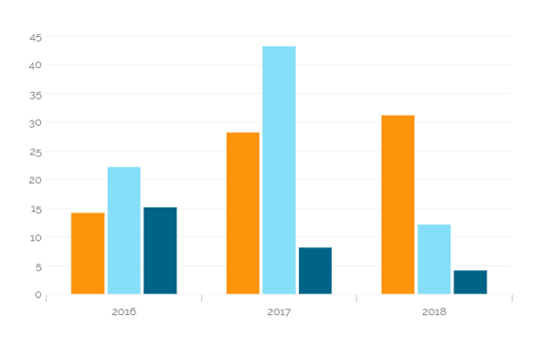
The following data was used to generate this example.
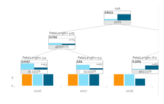
The Decision Tree presents outcomes from a series of decisions via a flow-chart like a diagram. Users can easily understand the sequence presented through this graph, so frequently it has been used as a decision-making tool, for analysis, or planning strategy.
The chart can either be used in predictive or descriptive manner. The best situation to use this chart is to study the current market in response to an existing or new product, or to understand the sequential elements involved in the financial matter (loan approval etc.)
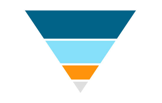
The Funnel chart can represent various stages in a process. As the shape suggests it widens at the top and narrows at the bottom this chart helps to pin point a phase where the maximum drop out occurred. This type of chart can describe a progressive reduction of data as it passes from one phase to the other where each phase represents different percentage of data contributing to the whole.
Funnel charts are good for displaying sales conversation data.
To evaluate the success of a promotional campaign.
To analyse recruitment process,
Stacked percentage bar charts
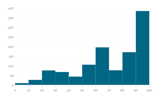
The X-Axis remains a continuous scale in the Histogram chart that makes it different from the Vertical Bar Chart. The Histograms make it easy to grasp where most values fall in a measurement scale, and how much variation is there. It is used to summarize a large amount of data or compare process results with specification limits.
Users can invert the funnel chart to see the things from a different point of view. It widens at the bottom and narrows at the top pin pointing to the various phases in a classified structure. This chart can be used to see the hierarchical structure of an organization or distribution process of fund/salary/profit etc.
The Inverted Funnel charts are good for displaying hierarchical Pattern.
To categorize the administrative structure in an organization
Stacked percentage bar charts
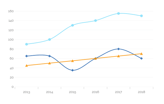
Line charts connect individual numeric data points to create a sequence of values. They are primarily used to display trends over a period.
View trends in data over a period
To indicate increasing revenue or varying stock price
Mixed Chart- Combine a line graph with column charts to provide visual cues for further investigation
Example- A column chart representing the numeric score of students combined with the line chart corresponding proficiency score
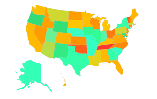
The Map chart is used to position data in a geographical context. Multiple layers are included to cover various information. Users can specify which layer to be marked as interactive layer as it is the only layer wherein items can be marked.
To display widely spread data or process in geographical set-up.
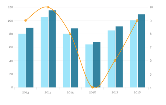
Mixed chart is a combination of line chart and column chart. Where it plots 3-series of data on the chart. Mainly used to emphasize different series of information on the chart.
Used to analyze company's budget vs. revenue.
Use stacked Column charts: Where multiple categories can be clubbed together on top of each other which makes addressing multiple questions becomes easier.
Use bars side by side: Where comparison between multiple categories becomes easier instead of toggle between charts.
Add color for quick insight: Displaying the bars with colors will make users to pay quick attention to important tasks.
The following data was used to generate this example.
| Employee | Mon | Tue | Wed | Thu | Fri |
|---|---|---|---|---|---|
| Alex | 10 | 19 | 8 | 24 | 67 |
| Lisa | 92 | 58 | 78 | 117 | 48 |
| Ram | 35 | 15 | 123 | 64 | 52 |
| Brian | 72 | 132 | 114 | 19 | 16 |
| Tim | 85 | 97 | 123 | 64 | 84 |
| Prom | 38 | 5 | 8 | 117 | 115 |
| Rajat | 13 | 44 | 88 | 98 | 96 |
| Ann | 31 | 1 | 82 | 32 | 30 |
| Vineet | 88 | 32 | 12 | 6 | 120 |
| Jeff | 47 | 114 | 31 | 48 | 91 |
The most widely used chart to show proportions, percentages and categories information. Mainly used for comparison where the users can find out easily which category is most popular and which is least popular.
Mainly used for comparison of categories available on the pie To find out top performers and least performers. Better for viewing if the category is limited to 6 or fewer.
Pie-Doughnut: Doughnut charts are similar to Pie-chart all you need to do is to switch the pie-chart to doughnut.
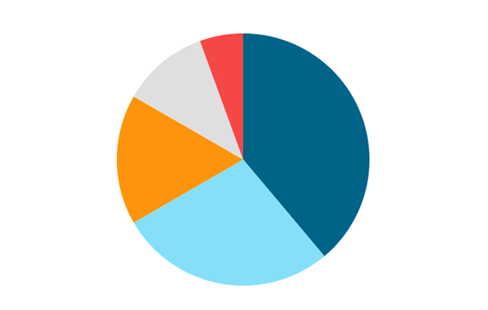
The following data was used to generate this example.
| Expense Categories | Doller In Millions |
|---|---|
| Sales Marketing | 30 |
| R&D | 20 |
| Admin&Gen Expenses | 10 |
| Production | 40 |
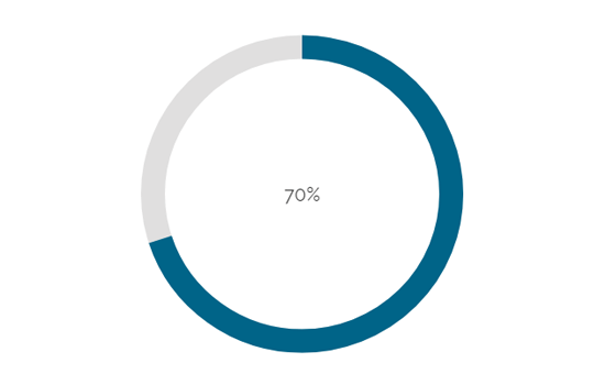
The Progress Pie chart or Circular Pie chart can be used to represent percentage values or progress status.
To show what percentage of a job is completed v/s what is left to be Completed
Doughnut chart, Progress Bar chart
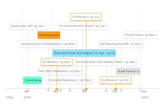
The Project Timeline is an interactive visualisation chart to visualize data in time. The data items can take place on a single date, or have a start and end date (a range). Users can easily move and zoom in the timeline by using the drag-drop and scroll functionalities. The time scale on the axis is adjusted automatically, and it supports scales ranging from milliseconds to hours to days to years. The Project Timeline uses regular HTML DOM to render the timeline and items placed on the timeline. This allows for flexible customization using the CSS styling.
To track project deadlines and status with timeline template.
To update status throughout the project.
The following data was used to generate this example.
| Region | Country | 2008 | 2009 |
|---|---|---|---|
| East Asia & Pacific | Cambodia | 3 | 20 |
| East Asia & Pacific | Australia | 19 | 25 |
| Europe & Central Asia | Ukraine | 7 | 16 |
| Europe & Central Asia | Russia | 9 | 19 |
| Europe & Central Asia | Kazakhstan | 18 | 26 |
| Europe & Central Asia | Afghanistan | 8 | 13 |
| Latin America & Caribbean | Paraguay | 6 | 27 |
| Latin America & Caribbean | Argentina | 9 | 18 |
| Middle East & North Africa | Libya | 6 | 23 |
| Middle East & North Africa | Tunisia | 12 | 13 |
| North America | United States | 5 | 25 |
| North America | Canada | 17 | 11 |
| Sub-Saharan Africa | South Africa | 3 | 15 |
| Sub-Saharan Africa | African Republic | 5 | 24 |
| Sub-Saharan Africa | Niger | 10 | 6 |
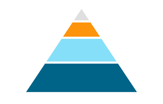
Pyramid charts are used when items needs to be shown in a hierarchical structure. Generally the chart will be a triangle sliced into number of parts. The items and topics will be represented in a progressive order based on the quantity and size.
Hierarchical Breakdown: When there is a need to represent levels of hierarchy in an organization or in a process this is going to be the best fit.
Funnel Chart: This is just a reversed format of Pyramid chart.
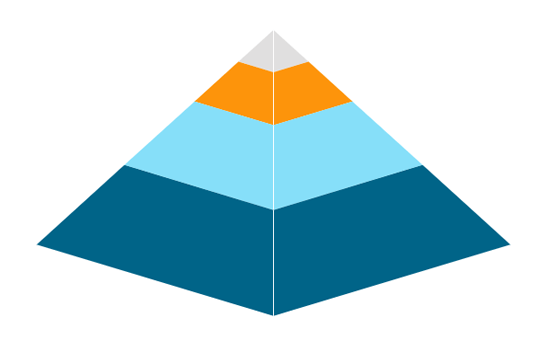
The following data was used to generate this example.
| Stage | Count |
|---|---|
| Lead Generation | 100 |
| Inquiry | 80 |
| Demonstration | 50 |
| POC | 40 |
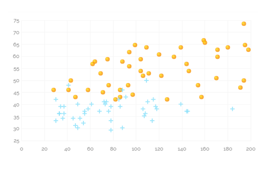
Scatter plots are used to analyze patterns in bivariate data. Data is plotted on horizontal and vertical axis in the attempt to show how much one variable is related to another. They are the best visualisations which gives users a sense of trends, correlations and outliers from the data.
When to find Relation between different variables.
When trying to find potential root cause of a problem.
Add-up Filters: Filters like combo box can be added on to the scatter plot chart to filter data based on a condition.
Differentiate by Type: Data plotted on the charts may contain different categories. These categories can be identified by assigning different shapes.
The following data was used to generate this example.
| Profit | Sale | Expense |
|---|---|---|
| 9 | 81 | 63 |
| 98 | 5 | 89 |
| 5 | 5 | 59 |
| 5 | 5 | 59 |
| 51 | 50 | 73 |
| 41 | 22 | 14 |
| 58 | 24 | 20 |
| 78 | 37 | 34 |
| 55 | 56 | 53 |
| 18 | 45 | 70 |
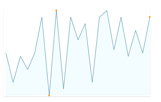
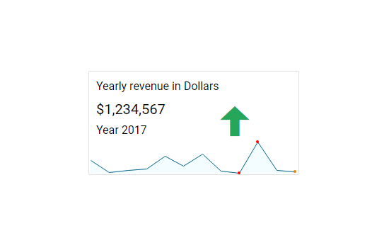
A Sparkline is a very small chart that is drawn without axes and lacks some chart-specific elements (such as legend, title etc.). The Sparkline chart can be easily embedded in the text as it performs more like an inline element (rendered inside a span) as opposed to the standard charts, which behave like block elements. The main purpose attached with the Sparkline Chart is to show a trend of something unique.
Spider chart is also known as Radar chart which is used to plot values of each category along the axis which starts at the center of the chart and extends up to the end of the radius. It is a two-dimensional chart type designed to plot one or more series of values arranged in the form of spokes.
When there is a need to analyze performance areas in an organization the spider chart would be the best fit to look for.
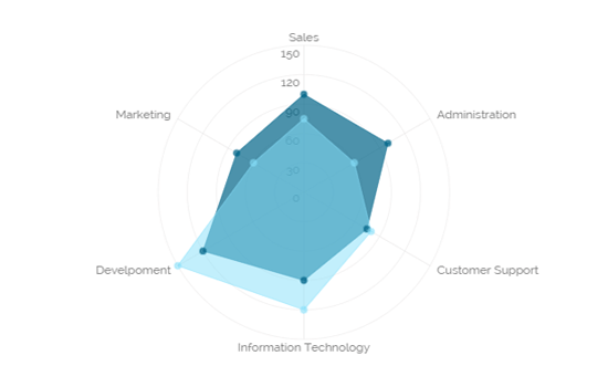
The following data was used to generate this example.
| Department | Allocated_Budget | Actual_Spending |
|---|---|---|
| Sales | 100 | 75 |
| Marketing | 80 | 60 |
| Development | 120 | 150 |
| Information Technology | 90 | 40 |
| Customer Support | 75 | 80 |
| Administration | 60 | 60 |
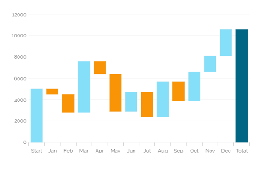
A Waterfall Chart is a form of data visualisation that helps in understanding the cumulative effect of sequentially introduced positive or negative values. The waterfall chart is also known as a flying bricks chart or Mario chart due to the apparent suspension of columns (bricks) in mid-air.
The Waterfall Chart is used to show how an initial value is increased and decreased by a series of intermediate values, leading to a final value.
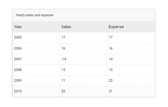
Data Grid is used to represent data in tabular form. Data Grid is also known as 'Grid View' as the data will be displayed within a grid.
The following data was used to generate this example.
| Country | State | City | Population | Revenue | Indicator |
|---|---|---|---|---|---|
| USA | California | San Jose | 1000 | 10 | 10 |
| USA | California | San Francisco | 2500 | 45 | 45 |
| USA | California | Los Angeles | 4500 | 75 | 75 |
| USA | California | San Diego | 500 | 5 | 5 |
| USA | California | Santa Clara | 300 | 3 | 3 |
| USA | NewYork | Buffalo | 100 | 2 | 2 |
| USA | NewYork | NY City | 6000 | 78 | 78 |
| USA | NewYork | Rochester | 278 | 23 | 23 |
| USA | Texas | Houston | 3000 | 45 | 45 |
| USA | Texas | Austin | 3000 | 45 | 45 |
Paging Data Grid is used to represent data in tabular form. Paging data grids can be used to filter data using columns, comparison operators and search option provided.
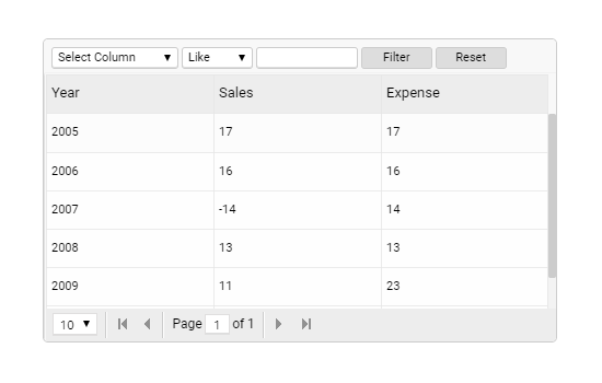
The following data was used to generate this example.
| Country | State | City | Population | Revenue | Indicator |
|---|---|---|---|---|---|
| USA | California | San Jose | 1000 | 10 | 10 |
| USA | California | San Francisco | 2500 | 45 | 45 |
| USA | California | Los Angeles | 4500 | 75 | 75 |
| USA | California | San Diego | 500 | 5 | 5 |
| USA | California | Santa Clara | 300 | 3 | 3 |
| USA | NewYork | Buffalo | 100 | 2 | 2 |
| USA | NewYork | NY City | 6000 | 78 | 78 |
| USA | NewYork | Rochester | 278 | 23 | 23 |
| USA | Texas | Houston | 3000 | 45 | 45 |
| USA | Texas | Austin | 3000 | 45 | 45 |
The Pivot grid also known as Pivot Table is a data summarization tool used in data visualisation software. Users can identify and select columns and rows of data in a data base or spreadsheet to obtain a desired report using the pivot grid tool. A pivot grid does not change the actual database or spread sheet, but turns the data in such a way that it can be viewed from the different perspectives.
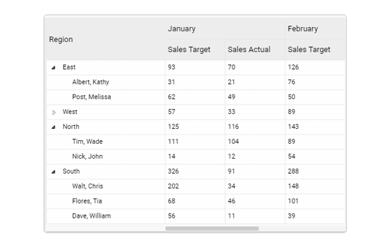
Scorecards are similar to Data grids; where data can be displayed in hierarchical format, and alerts can be set.
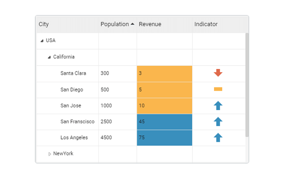
The following data was used to generate this example.
| Country | State | City | Population | Revenue | Indicator |
|---|---|---|---|---|---|
| USA | California | San Jose | 1000 | 10 | 10 |
| USA | California | San Francisco | 2500 | 45 | 45 |
| USA | California | Los Angeles | 4500 | 75 | 75 |
| USA | California | San Diego | 500 | 5 | 5 |
| USA | California | Santa Clara | 300 | 3 | 3 |
| USA | NewYork | Buffalo | 100 | 2 | 2 |
| USA | NewYork | NY City | 6000 | 78 | 78 |
| USA | NewYork | Rochester | 278 | 23 | 23 |
| USA | Texas | Houston | 3000 | 45 | 45 |
| USA | Texas | Austin | 3000 | 45 | 45 |
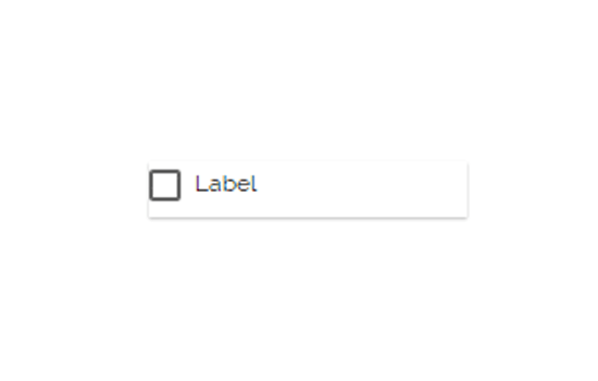
Check Box is used to filter data on any associated components. Enabling a check box will change the data displayed in the associated components.
Combo Box is used to filter data on any associated components. Selecting an item from the drop down menu will change the data displayed in the associated components.
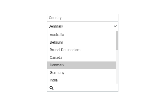
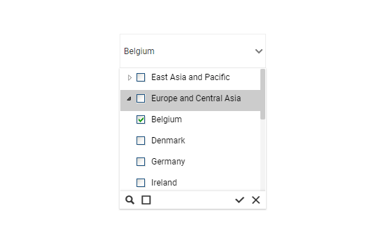
Hierarchical Combo Box is similar to Check Box and Combo Box but here the list will be arranged in the hierarchical manner and users will be allowed to select multiple items simultaneously.
When users should be given the option to select 1 or more cities that will be used in the table/chart (instead of displaying data for all cities)
The following data was used to generate this example.
| Country | State | City | Population | Revenue | Indicator |
|---|---|---|---|---|---|
| USA | California | San Jose | 1000 | 10 | 10 |
| USA | California | San Francisco | 2500 | 45 | 45 |
| USA | California | Los Angeles | 4500 | 75 | 75 |
| USA | California | San Diego | 500 | 5 | 5 |
| USA | California | Santa Clara | 300 | 3 | 3 |
| USA | NewYork | Buffalo | 100 | 2 | 2 |
| USA | NewYork | NY City | 6000 | 78 | 78 |
| USA | NewYork | Rochester | 278 | 23 | 23 |
| USA | Texas | Houston | 3000 | 45 | 45 |
| USA | Texas | Austin | 3000 | 45 | 45 |
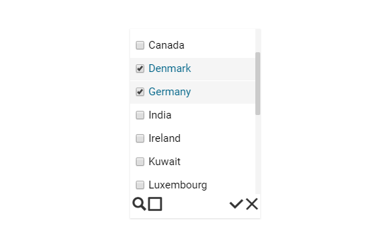
List box is a component used to filter data. All available items are displayed as a list. Users can select multiple items simultaneously by holding the CTRL-key. Select items will determine the data that is displayed in any associated chart(s).
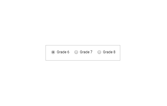
Radio Button is used to filter data on any associated components. Selecting a button will change the data displayed in the associated components.
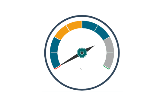
Gauges are measuring instruments for indicating volume, sales, temperature, etc... Gauges contain ranges of colors to indicate status (ex. below sales target, target, above sales target indicated by red, yellow, and green)
This component is used to add images to dashboard. There are some preexisting images available with the component. However, if users want to upload their own image, they can select the SVG path of that file and upload the image.

This component allows users to add images to the dashboard using the SVG format. The SVG code of an image should be copied & pasted into this component to display that image on the dashboard.

Users can embed a URL into this component. When the component is clicked, end-users will be redirected to the given URL page.

Users can select values by moving a slider horizontally between a minimum and maximum value provided with an increment (step).
Users can select values by moving a slider vertically between a minimum and maximum value provided with an increment (step).
The Info-Button component displays text or an image when clicked. This component can also be used to perform action(s) when clicked using Java Script.
Text Box component is used to display text. The text formatting can be customized.

The trend component is used to display trends based on the given data. An arrow indicating an upward or downward direction in the user-defined color can be shown to indicate the trending values.
The Label component displays text or an image. This component can also be used to perform action(s) when clicked using Java Script.
The Date Picker component performs action(s) on associated components. Data in associated components will change based on the selected date.
The Stepper component performs action(s) on associated components. Data in associated components will change based on the selected value (which can be increased or decreased by using the up/down arrow)..
The Image component performs action(s) on associated components. On clicking the component an action will trigger which affect associated components.

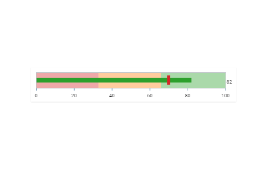
A bullet graph is a variation of a bar graph. The bullet graph is used to compare the Target and actual values in a single visualization. It features a single measure, compares it to a target, and displays it in the context of qualitative ranges of performance.
KPI tiles display the sum of quantity for active evolution. KPI is a measurable value that demonstrates how effectively a company is achieving key business objectives. Users can get a quick view of prominent trends, indicators, and values based on the various metrics of the business. Proper use of KPI helps in reducing the number of components used in the dashboard for multiple parameters for better performance.
Users can add various ‘Criteria’ serving as filters and save them for the future dashboard viewers to provide them with a unique insight into the displayed data. Users can extract quick insights without indulging in the pain of selecting the same set of filters repeatedly.
